📓 Project Overview
Prophecy Sauvignon Blanc - Label Production & Print Finishing
For Prophecy Wine’s Sauvignon Blanc label, I prepared an illustration-driven label for high-quality print production, engineering the artwork for CMYK reproduction, specifying spot/PMS colors, and building press-ready files to support premium finishes like foil stamping and embossing. The final label was designed to be reused across multiple vintages, allowing the brand to maintain consistency over time while accommodating production updates and reprints.
🧗♀️ The Challenge
Illustration-heavy labels can lose detail, shift color, and print inconsistently, especially once specialty finishes (foil/emboss) are introduced. This project required maintaining the integrity of the artwork while engineering files for clean reproduction and press-ready accuracy.
💻 Design Ownership & Responsibilities
Converted and optimized illustration artwork for print production (CMYK conversion and color correction).
Specified and separated spot/PMS colors to preserve vibrancy and detail.
Built print-ready files with technical layers for specialty finishing (foil + emboss).
Proofed and refined typography/typesetting for final label layouts.
Produced client-facing 3D bottle renders to preview materials and finishes before press.
Coordinated revisions through proofing cycles and press checks to ensure accuracy and brand consistency.
Illustration provided by client; production, color, and print engineering owned by me.
🖨️ Print Engineering and Finishes
✓ CMYK conversion + color correction to retain tonal range and avoid muddy tones
✓ Spot/PMS separations for key accents to keep the label luminous on press
✓ Foil stamp designed to enhance focal points without overpowering the illustration
✓ Emboss/deboss plan to add dimension and tactile hierarchy
✓ Prepress-ready file setup (layering, naming, tolerances/registration-safe decisions)
Visuals
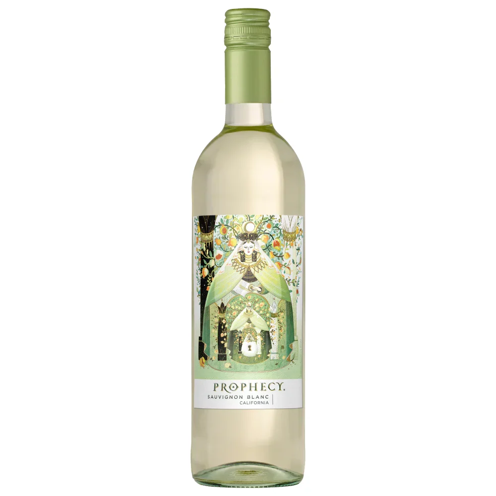
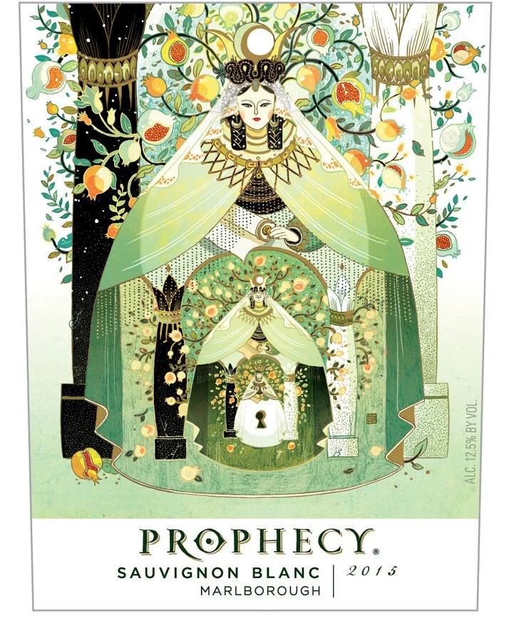
Final Label on Bottle
Press-ready label artwork produced for high-fidelity print reproduction and premium finishing.

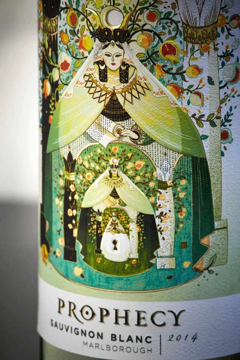
Label Detail
Color and detail optimized for print so fine illustration elements remain crisp and legible on shelf.
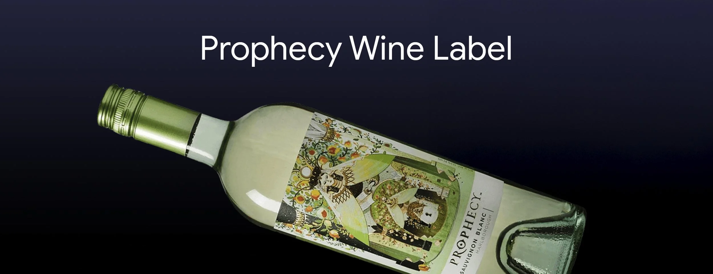
Real-World Print Check
Label readability and contrast validated in lighting conditions to ensure the design holds up beyond proofs.
Client Preview Render
3D rendering made in Studio Visualizer. Used to review label placement, scale, and finish intent before going to press.